A second chance at a first impression
A lesson in re-branding from international restaurants and clothing companies
Once your brand is cemented in the minds of consumers it’s hard to change their opinions – “you only get one chance at a first impression” is the cliche phrase, but re-opening eyes to a brand is done all the time with varying degrees of success.
Re-branding is a sensitive matter as it’s easy to alienate your clientele without attracting new shoppers or to lose sight of what your brand stands for; but in the face of bankruptcy, fading or emerging trends, or brand appropriation rebranding may be the only thing that can save a company from extinction.
So how do you do it well? Let’s look at two massive fast food chains and two clothing empires, to see who has done it right and wrong.
“YOUR BRAND NAME IS ONLY AS GOOD AS YOUR REPUTATION.” – RICHARD BRANSON, FOUNDER OF THE VIRGIN GROUP
Remember Kitchen Fresh Chicken?
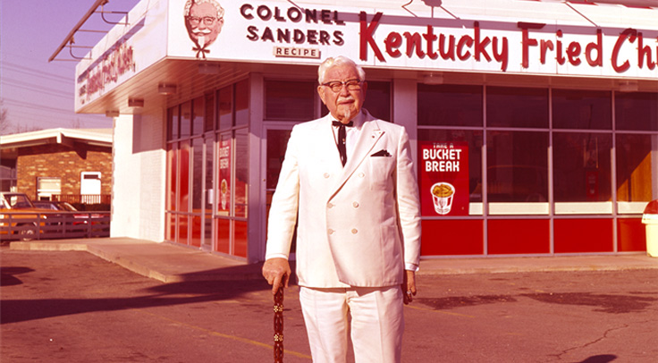
Kentucky Fried Chicken started as a roadside restaurant selling fried chicken during the depression, where Colonel Sanders perfected his Original Recipe. After some success Harland Sanders knew he had a fast food niche, as the market was largely dominated by burgers.
60s – 70s
The fried chicken flourished in the 60s, and by 1970 Colonel Sanders was serving 40 countries via 3000 locations.
Through the 80s they were a go-to in the fast food game, offering buckets that could feed a whole family with trusty picnic sides like coleslaw and potato salad to round out a ‘proper meal’.
1990s
In the 1990s fried foods were scrutinized, villainized and accused of causing heart attacks, obesity and a wide range of health problems.
The word “fried” was basically a culinary curse word, and reminded diners that fried chicken was a hazard to their well-being. To shed the negative attitude toward their food they dropped all but the initialization and the chain was known simply as KFC.
“ONE HAS TO REMEMBER THAT EVERY FAILURE CAN BE A STEPPING STONE TO SOMETHING BETTER.” – COLONEL HARLAND SANDERS, FOUNDER OF KFC
2000s
In the 2000s they took it one step further, KFC shed their deep-fried, Southern persona for a more youthful, healthy concept.
After being referred to as simply ‘KFC’ for so many years they attempted to repurpose their abbreviation as “Kitchen Fresh Chicken’ in 2004. They did away with the finger licking inspired by their previous – greasier – marketing, and ushered in a new era for the poultry giant that was hip, fresh, and completely unrelatable. It was such a disingenuous move by the company that consumers felt lost. Was it a new image? Was it a new menu? Was it healthier items? Nope. It was no more than a new phrase they attempted to affix to an old concept. They didn’t even bother to change the font.
The ad was straightforward enough – say the phrase about 80 times before you see the bucket for KFC. But instead of ‘oh, KFC is Kitchen Fresh Chicken’ the response was ‘oh, it’s just KFC’. The new branding didn’t last long as they deserted this campaign within the year, reverting back to the moniker “KFC” and previous branding efforts.
I give credit to the marketing department at KFC for being willing to take a stab at some big concepts since then. They’ve tried their hand (literally) at some stunts with varying success, and continue to try new things both digitally and on TV. Along the way they’ve stuck with the moniker KFC and the general branding in stores and online, which has helped them avoid any misgivings from their customers.
FROM CAFETERIA TO CONTEMPORARY, MCDONALD’S KEEPS UP.
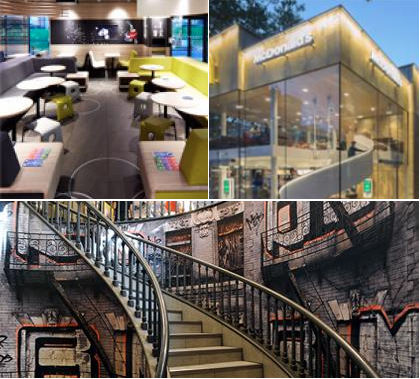
McDonald’s worked slow and steady to change not only their menu but also the atmosphere within their restaurants which kept the fast food giant relevant in a quickly changing fast food and semi-casual restaurant atmosphere.
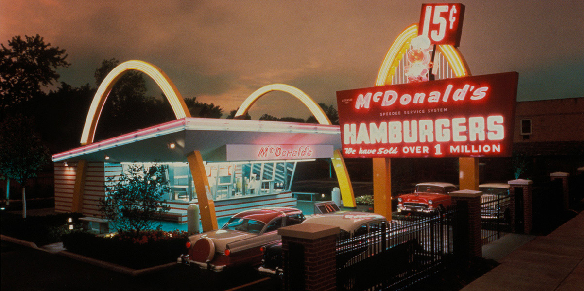
McDonald’s began in the 50s and sparked a food movement. What the world wanted was faster food, and they didn’t really care what was in it – cue high sodium food dripping with tasty grease. The decor matched the tone with plastic, cafeteria type banquettes, tables and chairs. They were the poster child of cheap, fast food.
60 years later people are concerned about sodium intake, fiber quantity and carb content. McDonald’s was in need of an update; sales were down significantly, and only falling further. Dubbed “Rotten Ronnie’s”, they were stuck with the reputation of single handedly bringing obesity to the US. Attacked by “Supersize Me” the major chain made some changes to their menu like removing the supersize option, and adding a healthier happy meal option for adults called “Go Active” which even included a branded pedometer.
“IT IS CUSTOMERS THAT DECIDE IF WE SUCCEED.” – STEVE EASTERBROOK, CEO OF MCDONALD’S
In 2014 McDonald’s embarked on an incredible transformation – more than changing the logo and the corporate colours.
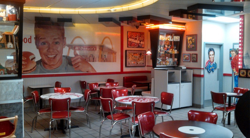
They added new menu items, created new stores and renovated old ones, and overhauled their entire aesthetic. In fact, anyone familiar with McDonald’s through the 80s would have a hard time recognizing the brand beyond the golden arches inviting diners in from the street. Gone are the rickety tables, the abrasive lighting and the tacky packaging. They’ve added salads to the menu and developed menu items that are more than just patty and bun. They’ve embraced a more upscale interior design with concrete tables, homey elements like fireplaces and even classed up the uniforms. They’ve made commitments to using cage free eggs, recycled sources for the fibre-based packaging of their takeout containers and are dedicated to ensuring there are healthier options on their menu.
They’ve been strategic and slow, introducing McCafes with cafe-inspired breakfast options like muffins and croissants. Their greatest asset has been their coffee evolution.
Coffee sales have increased 70% since they unveiled their McCafe brand in 2007. They’ve maintained their golden arches, and the three menu items that make up 40% of their sales: Big Macs, Egg McMuffins and fries. Its this combination of improvements and sticking to mainstays that has kept their old customers returning while gaining new ones.
McDonald’s grew from a drive-in restaurant in the 30s to a chain covering the entire globe. They developed a brand on what was needed at the time – fast food on the go. As our needs have changed McDonald’s have stayed relevant by making menu adjustments and dining room renovations slowly and carefully to avoid losing their customer base.
The Gap’s lapse in judgement
Falling sales, changing consumer climate and a dated look are all good reasons to rebrand, but some companies have chosen to rebrand out of the blue, and in the Gap’s case it was a disaster.
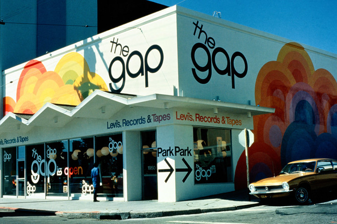
The very first Gap store opened in 1969 in San Francisco. They sold Levi’s jeans, but also records and tapes, not unlike the current Urban Outfitters approach. Founders Donald and Doris Fisher rode the brink of bankruptcy until they realized that products at lower prices sell better. By the late 70s the clothing store expanded to 180 outlets in 21 states.
They’ve stuck with their classic white on blue logo since it’s inception in 1986, and it had been a relevant and recognizable look for their brand throughout the 90s and 10s.
After 24 years they wanted a more modern, fresh look and implemented a sudden, stark change. Unfortunately the change seemed to embody a variety of bad choices all at once. The font was a rip-off of American Apparel (in much despised (and loved) Helvetica), the little blue gradient box was designed as an homage to the old logo, but played out more like an afterthought. The new look conjured feelings of cheap, corporate goods rather than the modern feel they were going for; stripped down no more than a stamp, devoid of anything consumers could relate to, and the public was not interested.
Shoppers took to Facebook and Twitter so vehemently the logo was changed back within a week.
One Facebook user responded, “This is the worst idea Gap has ever had. If this logo is brought into the clothing [store] I will no long[er] be shopping with the Gap. Really a bummer because 90% of my clothing has been purchased there in the last 15+ years.” The damage control they attempted seemed half-hearted – they tried to crowdsource a new logo, asking anyone and everyone for their suggestions; a move protested loudly by the design community. Their ‘Make Your Own Gap Logo’ site went viral, garnering almost 14,000 parodies, with Twitter accounts for both the old and new Gap Logo.
“IF YOU THINK GOOD DESIGN IS EXPENSIVE, YOU SHOULD LOOK AT THE COST OF BAD DESIGN.” – DR. RALF SPETH, CEO OF JAGUAR

They’ve stuck with their classic white on blue logo since it’s inception in 1986, and it had been a relevant and recognizable look for their brand throughout the 90s and 10s.
After 24 years they wanted a more modern, fresh look and implemented a sudden, stark change. Unfortunately the change seemed to embody a variety of bad choices all at once. The font was a rip-off of American Apparel (in much despised (and loved) Helvetica), the little blue gradient box was designed as an homage to the old logo, but played out more like an afterthought. The new look conjured feelings of cheap, corporate goods rather than the modern feel they were going for; stripped down no more than a stamp, devoid of anything consumers could relate to, and the public was not interested.
“A BRAND IS NO LONGER WHAT WE TELL THE CONSUMER IT IS – IT IS WHAT CONSUMERS TELL EACH OTHER IT IS.” – SCOTT COOK, CO-FOUNDER OF INTUIT, DIRECTOR OF EBAY AND PROCTER & GAMBLE
Burberry’s reinvention and rise to new digital luxury
In 2004 Burberry found itself at the mercy of “binge drinking hooligans”. Banned in pubs all over Leicester the brand was far from the classy, effortless British brand we know today.
1900s
Thomas Burberry started as a coat company, outfitting explorers and motorists in the early 1900s.
The clothing company quickly became a high profile enterprise with major explorers wearing Burberry on newsworthy adventures and for creating the original trench coat for the War Office in the 1920s. The Burberry check pattern was used as the lining for this apparel and soon both the pattern a
2000s
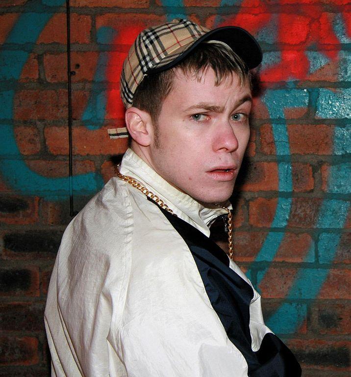
In the early 2000s Burberry became a favourite brand among football fans, wearing the brand’s polo tees with assorted tacky bling.
The amount of counterfeit Burberry check on the market flooded the ‘chav’ subculture often violent and lower class, which quickly eroded the company’s luxury status. The brand was in need of a change if they were to stay on top of the fashion market, and that change came with a new approach to marketing.
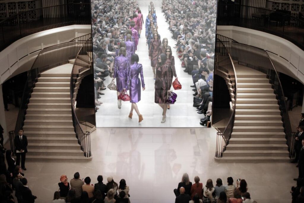
Without ever changing a logo Burberry began to take back their brand by applying their voice. They were at fashion shows, launched a website and embraced digital advertising. Apple was a big inspiration for the clothing company to step into the digital era of brand immersion. Burberry used clever innovations like the RFID chip added to purses and clothing that triggered mirrors to change to large-scale monitors, showing the pieces in real-world situations, or displaying the making of the garment in beautiful videography. Online came in-store with giant screens for playing runway shows, Acoustic Burberry (a section of their website devoted to new music talent in the UK), and various digital content.
Their digital approach was focused on reaching the younger consumer, fully immersed in social media, becoming one of the first major design companies on Facebook – a move they’ve repeated with Snapchat. They went back to their roots and focused on their trenchcoats, creating a microsite “The Art of the Trench” just for the jacket complete with a corresponding Tumblr where individuals can upload their own photo of them in their trenchcoat. After scaling back the amount of the classic plaid they were known for, it was reintroduced into their designs years later when the ‘hooligans’ had moved on. Burberry spent time and money on lavish films to express the brand during the holidays, and for live broadcasts of fashion shows. By 2016 they had re-established the upscale name, and drove up stock prices by over 170% in 6 years.
Even in trying times Burberry stuck to their brand in both look and feel. They undertook a rebranding effort which encompassed their stores, digital presence, and culture to regain their iconic status without abandoning the heart of their company – their clothing.
“IF PEOPLE BELIEVE THEY SHARE VALUES WITH A COMPANY, THEY WILL STAY LOYAL TO THE BRAND.” – HOWARD SCHULTZ, CEO OF STARBUCKS
Read more about brands and branding in these other Simple Simple Blogs:


