Calgary restaurant & bar advertising
Pin Bar is Calgary’s newest hotspot on 17th avenue. We created a very distinct aesthetic that would stand out in #yyc’s bar advertising scene.
- Brand strategy and design
- Campaign direction and design
- Online ad buys
- Information design
Brand Strategy & Design
We wanted people to immediately think, “this doesn’t look like a Calgary brand.” The aesthetic is faded-bright, fun and inspired heavily by a Mexican sign painterly look and feel.
The information design pays homage to the great history of sandwich shop order window menus.

Responsive Logo Design
Now that we’re in the “avatar generation” it’s important that a brand consider all elements of logo and asset use. We focused on a minimal logo almost completely devoid of words and inspired by the essence of the establishment, the pinball machines. It was important that the machine be easy to identify and stylized enough to be a unique brand identifier.
Responsive Logo Design
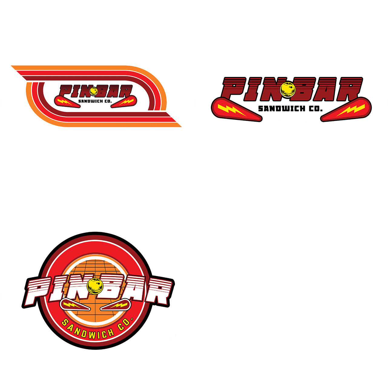
Every brand needs a fun story, so we made a couple of retro logos and did pre-promotion for the bar using that instead of the actual logo — the idea being that once we opened the bar with the “real” brand aesthetic that it would feel like Pin Bar had been around for years, a staple of Calgary’s bar scene.
We’re really excited to play around with this idea as we develop a narrative around the bar’s “history”.

